
当サイトでは実際に購入した商品のみをレビューし、アフェリエイトリンク付きでご紹介しています
Plotly Graphs: Changing the Display Position of Legends (Labels) [Layout]

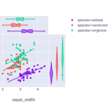
By default, the legend (label) of Plotly is displayed to the right of the graph.
This can shorten the width of the graph.
To expand the display width of the graph and make it easier to read, I will move the legend.
What you can learn from this article
- How to change the position of the legend (label) in Plotly graphs
- The meaning of the values passed to legend

For those who want to know about “Plotly,” please see a previous article first.
TOC
The Challenge and Goal
With Plotly, you can display interactive graphs.
However, the layout can sometimes make the graph hard to read.
For example, when displaying a line graph on a smartphone (portrait orientation) with the legend in its initial position.
The graph becomes squeezed due to insufficient screen width.
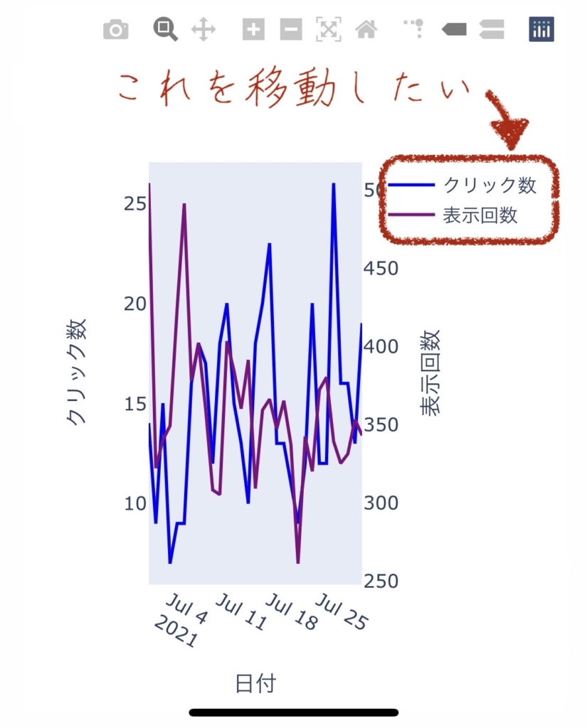
Change the position of the legend to increase the width of the line graph display!
The source code before the change can be checked in this article.
あわせて読みたい

【Python】Plotlyで2軸の折れ線グラフを作る方法
Plotlyで、インタラクティブな2軸のグラフを作りたい! PythonのPlotlyライブラリを使用して、インタラクティブなグラフを作成します。 数値が離れた2つデータを使…
Changing the Position of the Legend with update_layout
Before Change
After Change
Let’s call update_layout() and change the position of the legend.
The width of the graph has slightly increased. The source code for this graph is here.
import pandas as pd
import plotly.graph_objs as go
from plotly.subplots import make_subplots
...
fig.update_layout(legend=dict(x=0.01, y=0.99, xanchor='left', yanchor='top', orientation='h'))
...
Lines 19 to 24 pass arguments in fig.update_layout() to change the position of the legend.

Understanding the Values Passed to legend in update_layout

I managed to move it, but I don’t understand the meaning of the values.
Let’s explore the values of the legend!
Explanation of Each Item
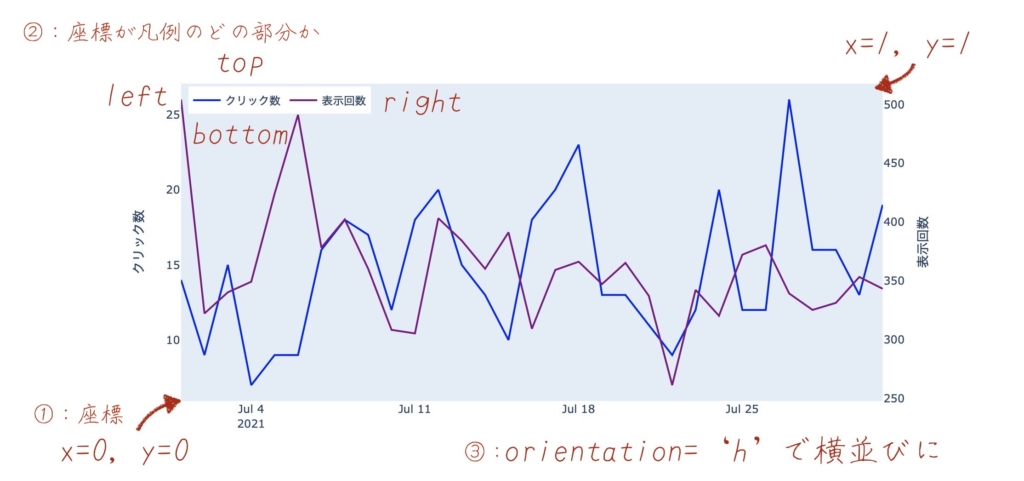
fig.update_layout(legend=dict(x=0.01, y=0.99, xanchor='left', yanchor='top', orientation='h'))- ① : x, y
-
Represents the X and Y coordinates. The bottom left of the graph is (0, 0) and the top right is (1, 1).
- ②: xanchor, yanchor
-
Specifies which part of the legend represents the coordinates specified in ①.
If you pass left and top, the top left of the legend matches the X and Y coordinates.
- ③: orientation
-
Aligns the legend horizontally.
Experiment
Let’s try changing the items passed to legend and see what happens.
fig.update_layout(legend=dict(x=0.9, y=-0.1, xanchor='left', yanchor='top'))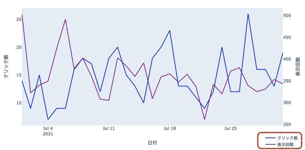
By changing the values of x, y, the position of the legend changed significantly.
You can set values smaller than 0 and larger than 1 for the coordinates.
And by removing orientation, the legend becomes vertically aligned.
We can now freely position the legend!
Reference Links
In solving this challenge, I referred to the following site.


Summary
To share the monthly access situation, I use Plotly to create interactive graphs.
あわせて読みたい

【運営報告】ブログの記録(2021年7月)
2021年7月のブログの運営報告をまとめます。 この記事でわかること ブログ記事数=約25では、どのくらいのアクセスがあるのか はじめに このブログは、2021年の年末ま…
I’m learning how to use Plotly and continually improving towards “something better.”
If you’re interested in how to create graphs, please refer to past articles.
あわせて読みたい

【Python】Plotly.Expressでインタラクティブな折れ線グラフを作る
Search Consoleのデータを、インタラクティブなグラフにして、WordPressへ表示する方法をご紹介します。Plotly.Expressを使って、とてもカンタンに実現できます。プログ…
あわせて読みたい
【Python】Plotlyで2軸の折れ線グラフを作る方法
Plotlyで、インタラクティブな2軸のグラフを作りたい! PythonのPlotlyライブラリを使用して、インタラクティブなグラフを作成します。 数値が離れた2つデータを使…
Thank you for reading to the end. I hope your life will be better for it.