
当サイトでは実際に購入した商品のみをレビューし、アフェリエイトリンク付きでご紹介しています
【Plotlyグラフ】凡例(ラベル)の表示位置を変える【レイアウト】

Plotlyの凡例(ラベル)は、デフォルトではグラフの右横に表示されます。
これによって、グラフの横幅が短くなってしまいます。
グラフの表示幅を広げて見やすくするために、凡例を移動します。
この記事でわかること
- Plotlyグラフの凡例(ラベル)の位置の変え方
- legendに渡す値の意味

「Plotly」について知りたい方は、まずは過去の記事をご覧ください
目次
解決したい課題と目標
Plotlyでは、インタラクティブなグラフを表示することができます。
しかし、レイアウトによっては、見づらいグラフになってしまうことがあります。
たとえば、凡例を初期表示のまま、スマートフォン(縦表示)で折れ線グラフを表示したときです。
画面の横幅が足りず、ギュッと縮んでしまいます。
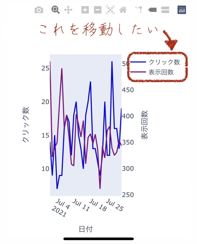
凡例の位置を変更し、折れ線グラフの表示できる幅を増やします!
変更前のソースコードはこちらの記事で、ご確認ください。
あわせて読みたい


【Python】Plotlyで2軸の折れ線グラフを作る方法
Plotlyで、インタラクティブな2軸のグラフを作りたい! PythonのPlotlyライブラリを使用して、インタラクティブなグラフを作成します。 数値が離れた2つデータを使…
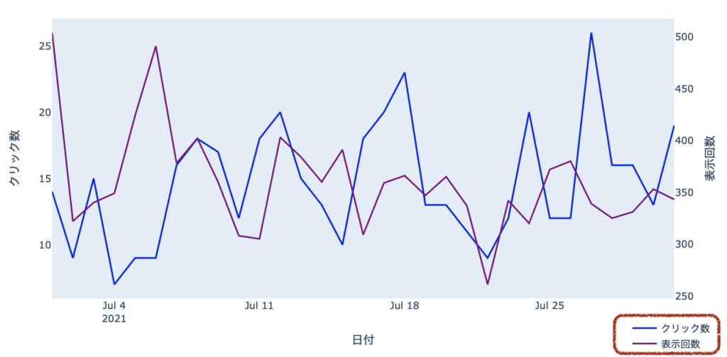
update_layoutで、凡例の位置を変える
変更前
変更後
update_layout()を呼び出し、凡例の位置を変更してみます。
グラフの横幅が、少し広くなりました。
このグラフのソースコードは、こちらです。
import pandas as pd
import plotly.graph_objs as go
from plotly.subplots import make_subplots

#データ読み込み
df = pd.read_csv('★ここは保存したCSVのフルパスに書き換えてください★')

#グラフ作成
fig= make_subplots(specs=[[{"secondary_y": True}]])

fig.add_trace(go.Scatter(x=df["日付"], y=df["クリック数"], name="クリック数", line=dict(color="blue")))

fig.add_trace(go.Scatter(x=df["日付"], y=df["表示回数"], name="表示回数", line=dict(color="purple")),secondary_y=True)

fig.update_xaxes(title="日付",showgrid=False)
fig.update_yaxes(title="クリック数", showgrid=False)
fig.update_yaxes(title="表示回数", showgrid=False, secondary_y=True)

fig.update_layout(legend=dict(x=0.01,
                              y=0.99,
                              xanchor='left',
                              yanchor='top',
                              orientation='h',
                              ))

fig.to_html(include_plotlyjs='cdn',full_html=False).encode().decode('unicode-escape')
19行目〜24行目の、fig.update_layout()で引数を渡し、凡例の位置を変更しています。

update_layoutで、legendに渡す値について

移動できたけど、値の意味がわかりません
legendの値について、調べてみました!
各項目の解説
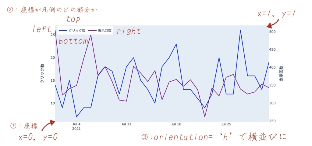
fig.update_layout(legend=dict(x=0.01,          # ①:X座標
                              y=0.99,          # ①:Y座標
                              xanchor='left',  # ②:X座標が凡例のどの部分を表すか
                              yanchor='top',   # ②:Y座標が凡例のどの部分を表すか
                              orientation='h', # ③:凡例を横並びにする
))- ① :x, y
-
X座標、Y標を表します。
グラフの左下が ( 0, 0 ) で、右上が ( 1, 1 )です。 - ②:xanchor, yanchor
-
①で指定した座標が、凡例のどの部分を表すか指定します。
leftとtopを渡した場合は、凡例の左上と、X座標・Y座標が一致します。
- ③:orientation
-
凡例を横並びにします。
実験
試しに、legendに渡す項目を変更してみましょう
fig.update_layout(legend=dict(x=0.9,
                              y=-0.1,
                              xanchor='left',
                              yanchor='top'
                              ))
x, yの値を変えたので、凡例の位置が大きく変わりました。
座標には、0より小さい値だけでなく、1より大きい値も設定することもできます。
そして、orientationを削除すると、凡例が縦並びになりました。
凡例を自由自在に配置できるようになりました!
参考リンク
今回の課題を解決するにあたり、以下のサイトを参考にさせていただきました。

また「legend」という英単語には、「伝説」の他に「凡例」「銘」といった意味があるそうです。

まとめ
毎月のアクセス状況を公開するため、Plotlyを使って、インタラクティブなグラフを作成しています。
あわせて読みたい

【運営報告】ブログの記録(2021年7月)
2021年7月のブログの運営報告をまとめます。 この記事でわかること ブログ記事数=約25では、どのくらいのアクセスがあるのか はじめに このブログは、2021年の年末ま…
Plotlyの使い方を覚えつつ、どんどん「より良いもの」にしていきたいです。
グラフの作り方について知りたい方は、過去の記事もご参照ください。
あわせて読みたい

【Python】Plotly.Expressでインタラクティブな折れ線グラフを作る
Search Consoleのデータを、インタラクティブなグラフにして、WordPressへ表示する方法をご紹介します。Plotly.Expressを使って、とてもカンタンに実現できます。プログ…
あわせて読みたい
【Python】Plotlyで2軸の折れ線グラフを作る方法
Plotlyで、インタラクティブな2軸のグラフを作りたい! PythonのPlotlyライブラリを使用して、インタラクティブなグラフを作成します。 数値が離れた2つデータを使…
最後まで読んでいただき、ありがとうございました。
みなさまの暮らしがより良くなりますように。